I wanted a poker identity without poker becoming my entire personality.
THE PROBLEM WITH POKER CLOTHING
I love poker. The language. The characters. The confidence. The needle. The ridiculous stories that follow you from one table to the next.
What I didn't want was to dress like a walking poker souvenir.
I wanted clothing that belonged at the table without having to shout POKER from across the room.
THE ATTITUDE WAS ALREADY THERE
Years ago I discovered AND1.
For anyone who missed it, AND1 was a basketball brand that became famous for streetball and statement clothing. The shirts were brash, competitive and funny. They talked trash. They had swagger. They took the attitude already on the court and gave it an identity.
That was what I bought into.
Not just a logo. A feeling. Put the shirt on and you were buying into the attitude.
Years later, I recognised something very familiar around a poker table.
The confidence. The ego. The needle. The trash talk.
Poker already has the attitude.
WHITE HOT ISN'T BRINGING THE ATTITUDE TO THE TABLE.
WE'RE JUST ADDING THE SAUCE.
THEN THERE WERE THE SKATE SHIRTS
I loved old skate T-shirts too.
Skaters had their own culture, and the clothing had a unifying identity of its own. Different brands. Different graphics. Same recognisable language.
A small mark on the left chest. Turn around and there was the big graphic across the back.
You didn't need a picture of a skateboard to know where the shirt belonged.
That stayed with me.
THE CLOTHES DIDN'T NEED TO EXPLAIN THE CULTURE. THEY BELONGED TO IT.
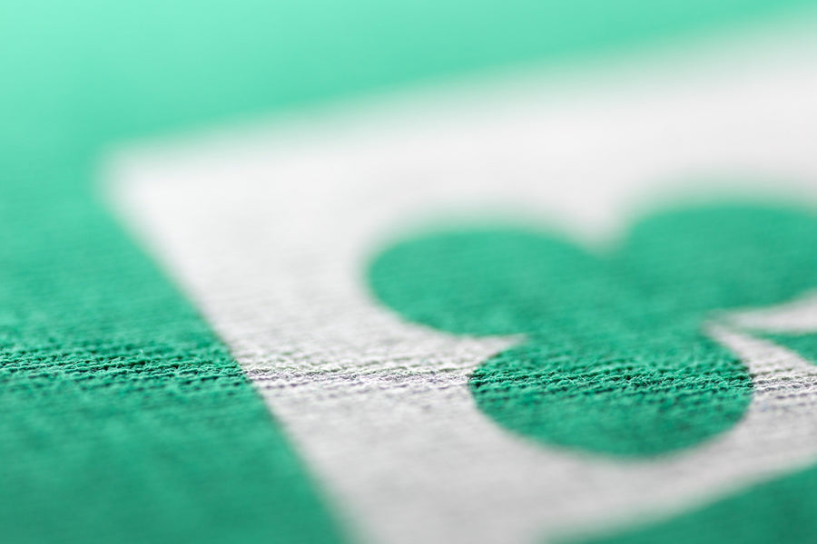
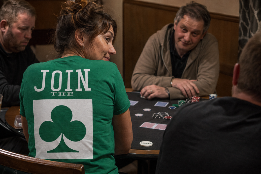
That became the WHITE HOT format: small front marks, big back graphics, strong type and poker references that players recognise without turning the shirt into a novelty item.
THEN I FOUND COLOUR
The colour came from somewhere much more personal.
I looked at my own wardrobe one day and realised how much of it had become black and grey.
I hadn't chosen a colour palette. It had just happened.
So I made a simple decision: stop buying black and grey clothes.
That forced me into colour. Green. Purple. Blue. Yellow. Pink. Orange.
And I liked it.
Then I started noticing the same thing everywhere. It wasn't just me. It was a problem for many.
People have completely different personalities and completely different styles, yet somehow so many wardrobes end up living in the same safe little corner of the colour chart.
Poker rooms are no exception.
WHITE HOT WASN'T GOING TO JOIN THEM.
WHITE ON COLOUR
The graphics themselves are deliberately simple.
White.
Partly because of the name. Mostly because it lets the garment do the shouting.
The white gives every design a common identity while the green, purple, blue, yellow, pink and orange give each piece its personality.
THE COLOUR IS THE ATTITUDE. THE WHITE IS THE STATEMENT.
THIS IS WHITE HOT
AND1 showed me how clothing could bottle an attitude.
Skate culture showed me how clothing could belong to a world without having to explain it.
Colour gave WHITE HOT its own visual identity.
Poker was already supplying everything else.
THE STORY GOES ON.
We start with T-shirts and caps.
But WHITE HOT is about table life, not one type of garment. Shirts and hoodies are part of where this goes next, along with whatever else earns its place around the table.
The rule stays simple.
IT HAS TO FEEL LIKE WHITE HOT BEFORE IT FEELS LIKE POKER MERCHANDISE.
See the current range on The Rail, or head to Table Talk.
FROM CASH GAMES TO THE FINAL TABLE.