Why Always Black?!
Search for poker clothing and you would think there are rules in cardrooms that say you must wear black.
Black T-shirt. White lettering. Maybe a gold crown if somebody is feeling adventurous.
It is not that those colours are bad. It is that poker has been visually trapped inside them for far too long.
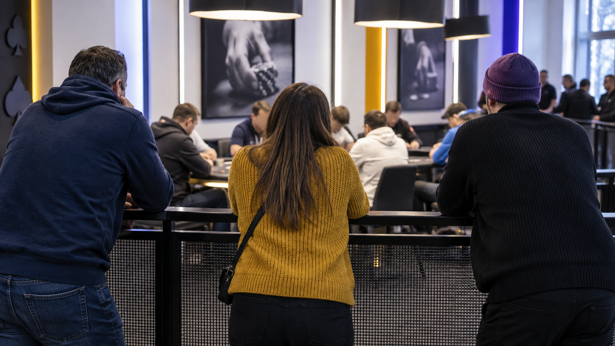
Glance across poker tables and you’re confronted by a mass of monochrome. Yet these aren’t the players that I see night in and night out.
Every table is awash with personalities.
The old boy with too much time and not enough action. The chatty, done-it-all player with all the table talk but who can’t walk the walk. The university kids. The chatty ladies. The quiet ones. The big-persona, no-speak guys. The girls studying and picking their moments. The player who somehow tells you three bad-beat stories before the first break.
Different people. Different ages. Different reasons for being there.
These players have a lot to say, but too often their clothes are caged in grey.
So why does poker clothing look nothing like the people who actually play poker?
The Players Aren’t Boring, So Why Is the Clothing?
Sit at a poker table for five minutes and you’ll see what I mean.

Somebody is talking too much.
Somebody else is saying absolutely nothing because they watched a poker film once and decided silence was intimidating.
Someone has made a terrible call and is now explaining why it was actually brilliant.
Someone has folded and desperately wants you to know they folded a monster.
And someone will tell you what they had.
They always bloody do.
That is live poker.
There is humour in it. Ego. Needle. Confidence. Insecurity. Characters you recognise within half an orbit.
And importantly, those people don’t all dress the same away from the table either.
Some live in T-shirts.
Some won’t touch one.
Some like a polo.
Some prefer a proper shirt.
Some want a hoodie.
Some want a vest.
Some want something fitted. Others absolutely do not.
Some want the loud piece in the room. Others want the person opposite them to notice the detail ten minutes into the session.
That range of people is the opportunity.
Poker clothing should not mean forcing everybody into the same garment any more than it should mean forcing everybody into the same colour.
Poker Streetwear Should Actually Look Like Streetwear
This is the bit I don’t really understand.
We have skate brands, basketball brands, football brands and streetwear brands that have built entire identities around the people who wear them.
Then poker comes along and apparently decides a black T-shirt with four aces on it will do.
Why?
Poker has its own language.
Its own jokes.
Its own dickheads.
Its own heroes.
Its own characters that somehow turn up at every cardroom in the country.
There is loads to work with.
And there is no reason that has to stop at a T-shirt.
A poker T-shirt does not need a royal flush across the chest to tell another poker player what it is.
A poker cap does not need a giant playing card embroidered on the front.
A polo should not suddenly have to look like corporate golf wear just because it has a collar.
A shirt should not need playing cards printed all over it to prove it belongs near a poker table.
A women’s vest should not feel like somebody has simply taken the men’s range and removed the sleeves.
The clothing can change.
The attitude does not have to.
Sometimes somebody across the table just has to read FOLD AND SHUT UP and they already understand it.
That feels far closer to poker culture than another graphic of four aces.
The best poker streetwear should make sense to poker players before anybody else.
If you want the broader argument for why poker clothing can be streetwear rather than casino costume, read Poker Streetwear: Poker Clothing Finally Grew Up.
Different Players Should Have Different Options
This matters just as much as colour.

Not everybody wants a T-shirt.
Not everybody wants a cap.
Not everybody wants the same fit, the same cut or the same level of noise.
And that is fine.
The whole point is that poker players are not one type of person.
So the long-term answer should not be one type of garment either.
There should be room for the loud T-shirt.
The cleaner polo.
The shirt that gives you a nod to poker without looking like fancy dress.
A women’s vest that was actually considered for the person wearing it.
A cap that carries the attitude without taking over the whole outfit.
Maybe other things we haven’t even thought of yet.
The important bit is that they all feel like they came from the same place.
Same attitude.
Same eye for colour.
Same understanding of the table.
Different clothes for different people.
Why WHITE HOT Uses Colour
WHITE HOT started from a pretty simple place.

I looked in my wardrobe and it was all black and grey.
I said I’m not buying that any more.
So I stopped, but realised there isn’t enough colour in the world.
If everyone else is doing black, grey and white, why would we do exactly the same thing?
That does not mean chucking every design onto every colour available.
Quite the opposite.
Too much choice can be lazy as well.
Here is the design.
Here are twenty colours.
You decide.
I would rather the brand made the decision.
This one works in purple.
That one belongs on green.
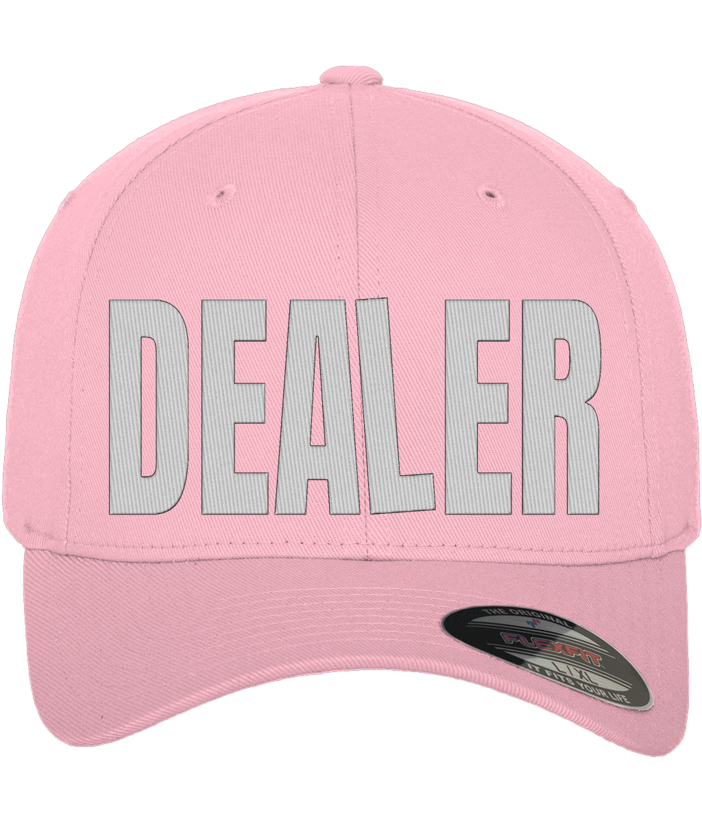
This cap should be yellow.
Maybe a polo needs to be cleaner.
Maybe a shirt needs a smaller detail and nothing more.
Maybe a women’s piece needs a completely different cut rather than being treated like an afterthought.
Fine.
But decide.
Colour should be part of the design, not an option added after the design is finished.
So should the garment.
That is why WHITE HOT is colour-led.
Not colour-for-the-sake-of-colour.
Colour with a point.
Colour Doesn’t Mean Throwing the Paint Box at It
This is where it is easy to go too far the other way.
I don’t want poker clothing to look like somebody has dropped a pack of highlighters down the front of it either.
Colour on its own does not make something good.
Bad design in purple is still bad design.
The point is to use colour properly.
One strong garment colour.
A clean graphic.
Enough.
Purple. White print.
Green. White print.
Blue. Yellow. Pink.
The garment itself might be a T-shirt, polo, shirt, vest, cap or something else entirely.
That part can evolve.
The principle stays the same.
You do not need another five colours in the artwork fighting for attention.
If the clothing already has something to say, let it say it.
Poker Clothing Got Stuck Somewhere
At some point poker clothing seems to have agreed on a uniform.
Black.
Grey.
White graphics.
Cards if required.
Maybe some chips.
Done.
And I get why.
Black is easy to sell. Grey is safe. White prints cleanly. Nobody is getting sacked for choosing any of them.
But when every brand makes the same safe decision, eventually the whole category starts looking like one enormous product page.
That is the problem.
Not black.
Not grey.
Sameness.
Poker players spend hours trying not to be predictable.
It is slightly ridiculous that the clothing made for them has become exactly that.
Why Does Everyone Sell Black Poker Clothing?
Because black sells.
That is probably the least exciting answer in this whole article, but it is also probably the right one.
Black is easy to design around. It goes with almost anything. Most people will wear it. If you want to make one garment and minimise the chance that somebody hates the colour, black makes perfect sense.
Grey is much the same.
From a business point of view, I get it.
But there is a difference between making the safest possible product and building a brand people actually remember.
If everybody takes the safe option, eventually the entire category becomes safe.
And safe gets boring very quickly.
Poker players should understand this better than most.
The safest play is not always the best one.
Poker Clothing Has Got a Bit Too Comfortable
I think this is probably the bigger problem.
Poker clothing knows what poker clothing is supposed to look like.
That sounds sensible until you think about it.
It means everyone starts from the same place.
Dark shirt.
Poker graphic.
Poker phrase.
Job done.
But if you keep making clothes by looking at what poker clothes already look like, you just keep getting more poker clothes that look exactly like poker clothes.
At some point somebody has to look outside the category.
Look at streetwear.
Look at skate clothing.
Look at sports brands.
Look at fashion.
Look at what people actually wear when they are not sitting at a poker table.
Because that matters.
I don’t want clothing that works only because I am inside a casino.
If I walk into a pub, shop or café wearing it, it should still look good.
That should not be a radical idea.
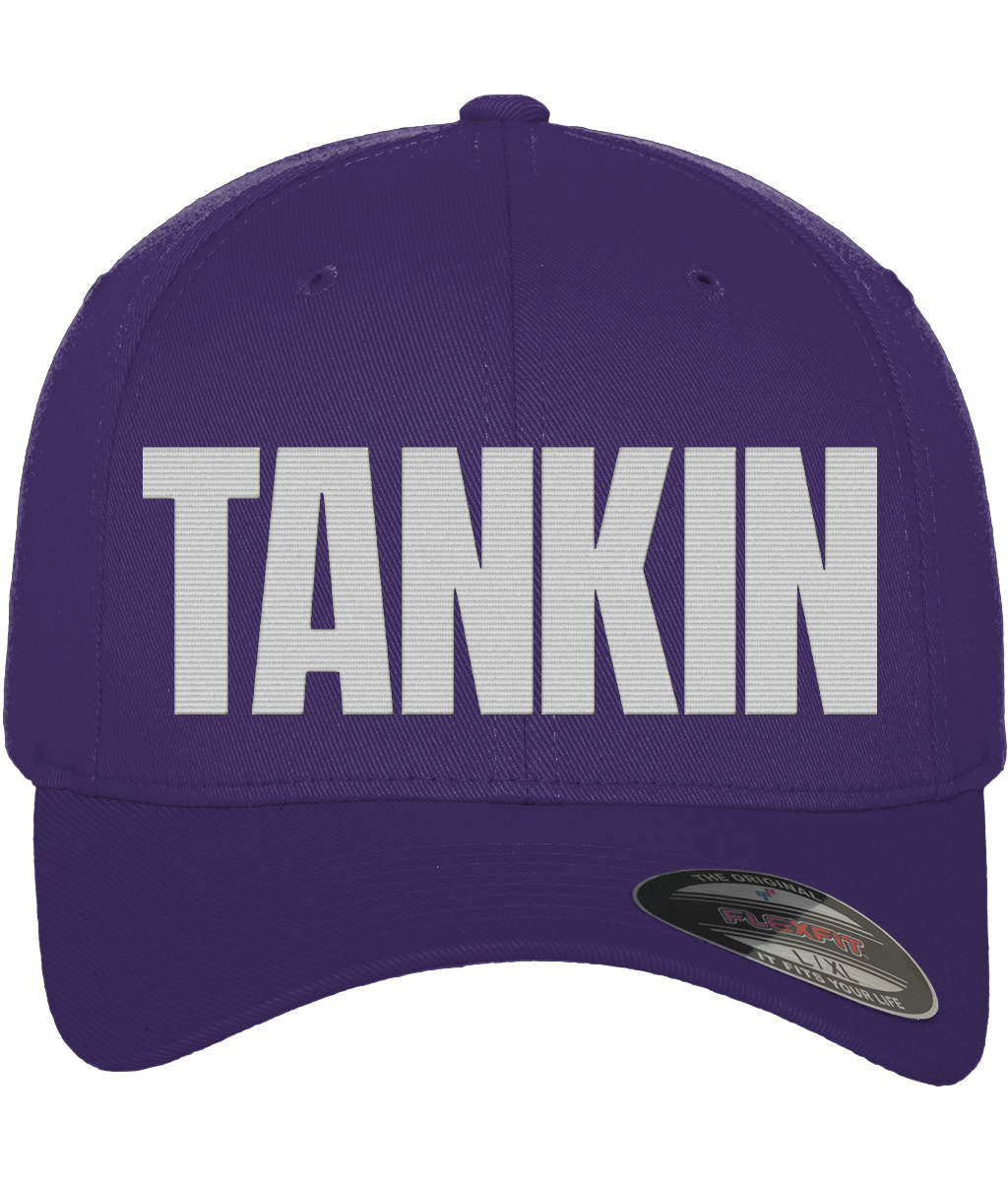
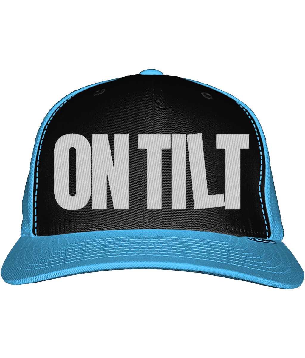
Poker Caps Have Exactly the Same Problem
Caps are everywhere in poker.

Sometimes you look across a table and there seem to be more caps than players.
They make sense. They are comfortable, they work for long sessions and somewhere along the way they became part of the unofficial poker uniform.
And yet most poker caps still seem determined to disappear.
Black.
Grey.
Dark navy.
Tiny logo.
Safe again.
There is nothing wrong with understated clothing, but understated and invisible are not the same thing.
A strong-coloured fitted cap with clean embroidery already has an identity before you even read what is written on it.
It does not need a giant logo.
It just needs somebody to have made an actual decision.
And the same principle should apply whether we are talking about caps, polos, shirts, T-shirts, vests or whatever comes next.
UK Poker Clothing Should Feel Like UK Poker
The UK poker clothing market is still pretty thin.
There is plenty of generic printed stuff.
Plenty of novelty poker clothing.
Plenty of official merchandise.
But not much that feels like it comes from the culture of playing poker here.
And UK poker has plenty of culture.
Pub leagues.
Local cardrooms.
Casino tournaments.
Weekend festivals.
If one of those bigger tournament days is actually in your diary, our What to Wear to a Poker Tournament guide is deliberately practical: comfort, layers and looking like yourself rather than a poker costume.
Players driving halfway across the country for a tournament and complaining about the structure before Level 2.
The same faces at the same tables.
The bloke who always seems to be there.
The player you know is going to say something the moment you sit down.
The woman quietly building a stack while everybody else is busy trying to look clever.
That is the bit worth building around.
Not just cards and chips.
Poker players.
All of them.
Choice Is Not the Same as Identity
I think clothing brands sometimes confuse offering more with being better.
Thirty colours.
Twenty styles.
Fifty variations.
Brilliant. Now what does your brand actually look like?
If every single customer can build a completely different version of every item, eventually the brand stops having much say in the matter.
There is something stronger about limitation.
A small run.
A handful of colours.
A decision that this is how this particular piece is supposed to look.
That gives it some identity.
But limitation does not mean every customer has to want the same item.
Quite the opposite.
The range can grow.
Different fits. Different garments. Different levels of attitude.
The important thing is that every piece still feels like WHITE HOT.
It also means when you see one across a poker table, you remember it.
And that is surely the point.
Black Isn’t the Enemy. Boring Is.
There are brilliant black T-shirts.
There are terrible bright ones.
There are great polos and dreadful ones.
A shirt can look brilliant or make you look like you are working behind the bar.
The garment is not the enemy.
The colour is not the enemy.
Boring is.
The problem is that poker clothing has spent years acting as though there are no other options.
Same colours.
Same graphics.
Same references.
Same shortcuts.
Poker has too much personality for that.
Poker Has Never Been Monochrome
Poker is noisy.
Competitive.
Funny.
Infuriating.
Social.
Occasionally ridiculous.
It is full of characters, arguments, terrible calls, brilliant folds, bad beats, needle and stories that improve slightly every time they are told.
That is the game I know.
Not a room full of identical personalities wearing identical clothes.
And not a room where everybody wants to wear the same thing either.
So maybe the question is not:
Why does poker clothing need colour?
Maybe it is:
Why did we ever decide poker clothing had to be black?
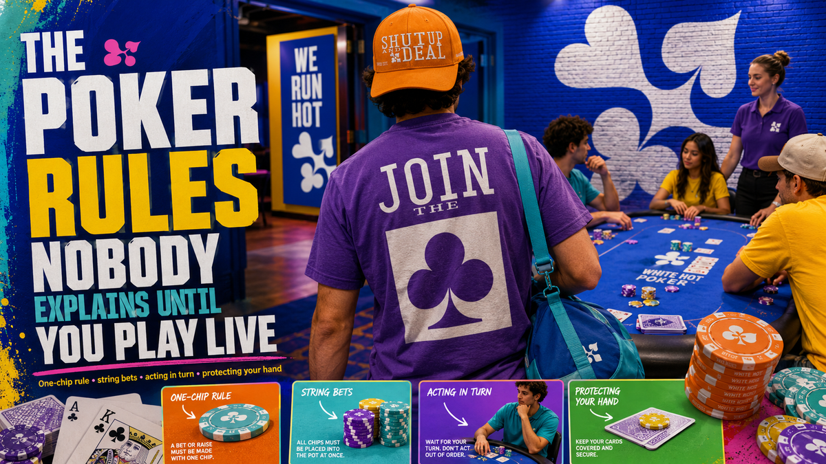
If you are newer to the live side of the game rather than the clothing side, The Poker Rules Nobody Explains Until You Play Live covers the bits a hand-ranking chart never tells you.
See the current poker T-shirts, fitted poker caps and the full WHITE HOT range on The Rail.
And as the range grows, expect the same idea to turn up in different forms.
Different people.
Different clothes.
Same table.
FROM CASH GAMES TO THE FINAL TABLE.