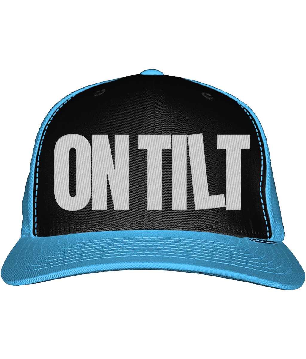
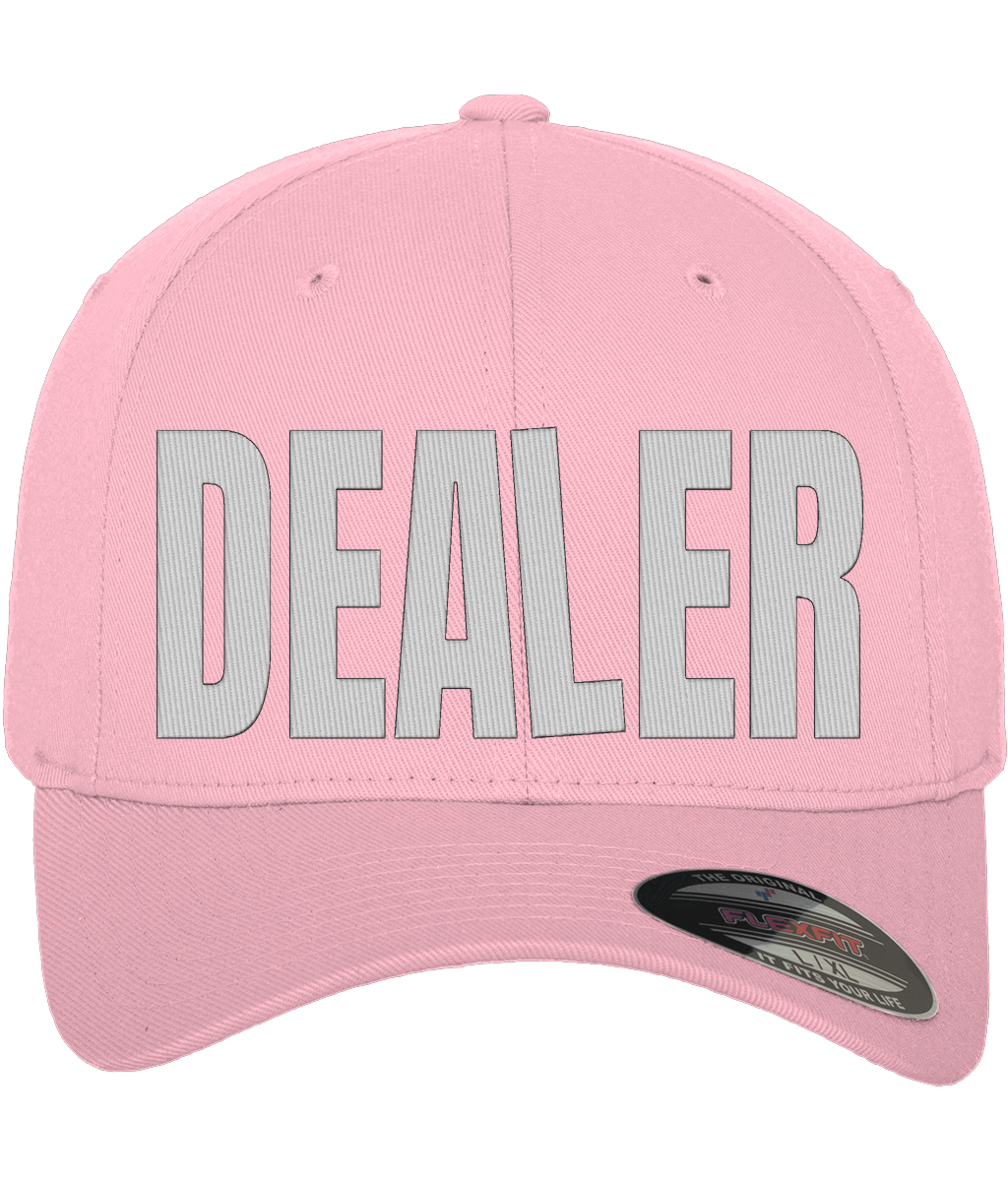
POKER CLOTHING SHOULDN'T LOOK LIKE POKER CLOTHING
Search for poker clothing and you already know what is coming.
Black T-shirt. Playing cards. A royal flush. Maybe some flames if somebody was feeling particularly dangerous.
That isn't how poker actually looks to us.
Poker is loud without needing to shout. It is a room full of personalities, bad decisions, good reads, ridiculous stories and people who remember the hand you wish they had forgotten. The clothes around the table should have some of that life in them.

UK POKER CLOTHING WITH SOME COLOUR IN IT
WHITE HOT started with a simple idea: poker T-shirts and poker clothing do not have to look like merchandise.
We wanted clothes that belong at a cash game, a pub tournament or a final table, but that still work when there isn't a deck of cards anywhere in sight. Bright colour. Strong type. Poker references that players recognise without covering everything in aces and chips.
The green and purple pieces from our first run are a good example. One carries the WHITE HOT four-suit mark. The other says what plenty of tables are thinking: NO ONE CARES WHAT YOU FOLDED.

MADE FOR THE TABLE
There is a difference between putting a poker graphic on a T-shirt and making clothing for poker players.
The second one starts with the culture. The things people actually say. The characters you meet every week. The bloke explaining why his fold was brilliant. The player who has told you the same bad beat three times. The little bits of table language that make perfect sense if you play and sound slightly unhinged if you don't.
That is the territory WHITE HOT is interested in.

THE PRODUCT HAS TO HOLD UP CLOSE
The first samples also gave us the chance to stop looking at mock-ups and start looking at actual cotton, actual print and actual colour.
So we got close. Very close.
The photography here isn't just about showing a design. At macro distance you can see the weave of the shirt running through the print, the edge of the ink and the way the graphic sits on the fabric. For an online poker clothing brand, that matters. A mock-up can tell you the idea. The real garment has to do the rest.


POKER STREETWEAR, NOT POKER UNIFORM
We're not trying to invent a uniform for poker players. Quite the opposite.
WHITE HOT is closer to poker streetwear: clothing shaped by the game rather than trapped inside it. The poker is in the language, the attitude and the four suits. The rest can come from somewhere brighter.
That is why colour matters so much to the brand. A poker room already has enough black, grey and dark navy in it. We would rather put green next to purple and see what happens.

The answer, apparently, is this.
FROM CASH GAMES TO THE FINAL TABLE.